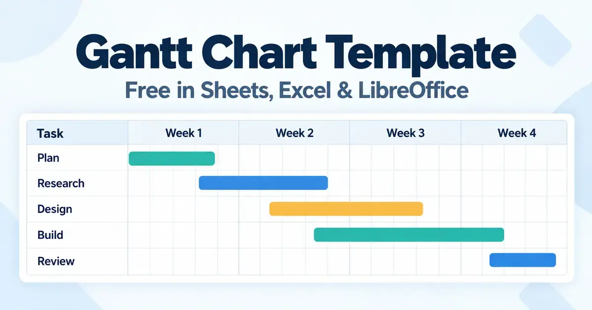
A Gantt chart template is a ready-made layout that turns a list of tasks and dates into a horizontal timeline of bars, so you can see at a glance when each part of a project starts, how long it runs and where it overlaps with everything else. Instead of building the maths and the chart from scratch, you fill in a few columns and the timeline draws itself. This guide explains what a Gantt chart template contains, where the idea came from, and exactly how to make or download one for free in Google Sheets, Microsoft Excel, and the open-source LibreOffice or Apache OpenOffice Calc. It also compares the best free tools and templates, lists the fields worth including, and covers the mistakes that quietly wreck a project schedule.
What is a Gantt chart template?
A Gantt chart template is a pre-built spreadsheet or document that plots project tasks against a calendar. Each task sits on its own row, and a coloured bar stretches across the columns to show its start date and duration. Read down the rows and you see the work; read across the columns and you see the time. Because the layout, formulas and formatting are already in place, a template lets a beginner produce a professional-looking schedule in minutes rather than hours.
Gantt charts are used for everything from planning a house renovation or a wedding to running a software release or a construction programme. The template scales with the job: a personal to-do timeline might have six rows, while a business project plan can run to dozens of tasks grouped into phases.
The parts of a Gantt chart
Almost every Gantt chart template is built from the same handful of elements. Understanding them makes any template easier to read and edit:
- Task list: the vertical column on the left naming each activity, often grouped under phases or headings.
- Timeline: the horizontal axis across the top, divided into days, weeks or months.
- Bars: the horizontal blocks that represent each task; their position shows the start date and their length shows the duration.
- Milestones: single points (often a diamond marker) that flag a key date or deliverable rather than a stretch of work, such as “sign-off” or “launch”.
- Dependencies: links showing that one task cannot start until another finishes, so the sequence stays logical.
- Progress: a shaded portion of a bar, or a percentage column, showing how much of a task is done.
Where the Gantt chart came from
The bar-schedule idea predates the name. A Polish engineer, Karol Adamiecki, devised an early version (his “harmonogram”) in the 1890s to schedule work in a steelworks. The American mechanical engineer Henry Laurence Gantt (1861–1919) developed and popularised the version we use today in the 1910s, and the chart took his name. Gantt charts were later used to plan large works such as the Hoover Dam. The concept is more than a century old, which is exactly why it still works: it is a simple, visual way to answer “what happens when?”
Quick Facts
- What it is: a ready-made layout that turns a task-and-date list into a timeline of bars.
- Best free spreadsheet tools: Google Sheets, Microsoft Excel, LibreOffice Calc, Apache OpenOffice Calc.
- Best free app: GanttProject (Windows, macOS, Linux; open source).
- Formats: .xlsx (Excel), Google Sheets, .ods (OpenDocument).
- Cost: free to build yourself or via free templates; dedicated apps range from free to paid.
- Skill level: beginner-friendly with a template; basic spreadsheet skills to build from scratch.
- Safe free downloads: Vertex42 free Gantt template (Excel, Sheets, .ods), Microsoft Create template gallery, GanttProject free software.
Why start from a template instead of building from scratch
Starting from a template saves the fiddly setup and helps you avoid errors. Spreadsheets do not include a true Gantt chart type, so a hand-built one relies on a stacked bar chart, hidden series and date formulas that are easy to get wrong. A good template has already solved those problems, so you get several advantages:
- Speed: type your tasks and dates and the bars appear immediately.
- Fewer mistakes: the duration and date formulas are pre-tested, so the timeline stays accurate when you change a date.
- Consistency: colours, fonts and layout look professional without design work.
- Learning by example: you can open the cells to see how the formulas and chart are wired together, which teaches you to adapt it.
The trade-off is flexibility: a downloaded template makes choices for you, and a very custom project may outgrow it. If you want full control, building your own from a stacked bar chart (below) is worth the extra half hour. Either way, the same skills that help with a Google Sheets calendar template carry straight over to a Gantt chart.
How to make a Gantt chart in Google Sheets
Google Sheets has no dedicated Gantt tool, but you can create one for free with a stacked bar chart and two helper columns. The method works the same on any device with a browser and needs no add-ons.
- Set up your table. In the first columns, list your Task name, Start date and End date. Format the two date columns as dates so the sheet treats them as real dates, not text.
- Add helper columns. Create a Start on day column and a Duration column. For the first task, “Start on day” is the start date minus the project’s earliest start date; “Duration” is End date − Start date (add 1 if you want the end day counted).
- Insert the chart. Select the Task name, Start on day and Duration columns, then choose Insert > Chart and pick Stacked bar chart.
- Hide the offset. Double-click a “Start on day” bar, open the Customize tab and set its Fill opacity to 0%. The invisible section pushes each visible “Duration” bar to its correct place on the timeline — the classic Gantt effect.
- Tidy up. Reverse the axis order if needed so the first task sits at the top, add a title, and recolour the duration bars by phase.
If your date maths misbehaves, brushing up on Google Sheets formulas such as subtraction and TODAY() will make the template much easier to extend.
How to build a Gantt chart in Excel
Microsoft Excel does not ship a built-in Gantt chart type either, but the stacked-bar method works the same way, and Excel offers ready-made templates as well.
- Lay out the data. Put Task, Start date and Duration in adjacent columns. Format the start column as Short Date and keep duration as a plain whole number of days.
- Insert a stacked bar. Select the start and duration data, go to the Insert tab and choose Stacked Bar under the bar chart options.
- Make the start series invisible. Click any start-date bar, open the fill options and set the fill to No fill. Only the duration bars remain visible, positioned along the timeline.
- Fix the task order. Right-click the vertical axis, open Format Axis and tick Categories in reverse order so tasks read top to bottom.
- Add progress (optional). Overlay a second, narrower bar or use error bars sized by a percent-complete column to show how far each task has advanced.
If you would rather not build one, Excel’s template gallery and trusted third parties offer free downloads that do all of this automatically — see the comparison further down.
How to create a Gantt chart in LibreOffice or OpenOffice Calc
The free, open-source suites handle Gantt charts well, and the same stacked-bar trick applies in LibreOffice Calc and Apache OpenOffice Calc. This is a good option if you want a genuinely free, offline, install-once tool with no subscription.
- Build the table. Create columns for Task name, Start (as an offset in days) and Length (duration in days).
- Insert the chart. Select the data, choose Insert > Chart, pick Bar and then the stacked subtype.
- Hide the first series. Double-click a “Start” bar to open the data-series dialog, go to the Area tab and set the fill to None. The remaining “Length” bars form the timeline.
- Finish. Adjust the axis so the first task appears at the top, then label and colour the bars.
LibreOffice also offers free Gantt chart template extensions (including a “simple” version) with a percent-complete field, and Vertex42’s free template is available in the OpenDocument (.ods) format that both suites use natively. If you are choosing between the two suites, our guide to LibreOffice and Apache OpenOffice explains which is better maintained. For heavier scheduling, our page on Microsoft Project compared with OpenOffice is worth a read.
Free Gantt chart templates and tools compared
The right choice depends on whether you want a spreadsheet template you own outright or a dedicated app with drag-and-drop scheduling. The table below compares safe, legitimate options across price, platform and who each one suits. Spreadsheet templates give you full control and offline use; dedicated tools add dependencies, resource tracking and easier collaboration.
Comparison
| Tool / template | Type | Price | Platform | Best for |
|---|---|---|---|---|
| Google Sheets | Spreadsheet (build your own) | Free | Web, mobile | Sharing and quick personal plans |
| Vertex42 Gantt Template | Spreadsheet template | Free for private use (Pro paid) | Excel, Sheets, .ods | Ready-made, own-it template |
| GanttProject | Desktop app (open source) | Free | Windows, macOS, Linux | Dependencies and offline use |
| TeamGantt | Web app | Free tier; paid plans | Web | Drag-and-drop team plans |
| Instagantt | Web app | Freemium | Web | Simple online scheduling |
| GanttPRO | Web app | Paid (from ~US$7/user/mo) | Web | Growing teams on a budget |
| Microsoft Project | Dedicated PM software | Paid (Planner plans / one-time licence) | Web, Windows | Large organisations |
For most personal and small-business plans, a free spreadsheet template is enough. Step up to a dedicated tool only when you need automatic dependency lines, resource loading, or several people editing the same live plan.
What to include in your Gantt chart template
A useful Gantt chart template captures more than start and end dates. The columns you add on the left determine how much the chart can tell you. Consider including:
- Task and phase: a clear task name, grouped under a phase or work-breakdown heading.
- Start date, end date and duration: let one be a formula so the three always agree.
- Owner: who is responsible, so nothing falls through the cracks.
- Percent complete: a simple 0–100% field to shade progress.
- Dependencies: a note of which task must finish first.
- Milestones: zero-duration markers for sign-offs, deliveries or deadlines.
- Status or notes: a short column for “on track”, “at risk” or blockers.
Keep it lean. A template with ten columns nobody updates is worse than four columns that stay current. If your project also needs money tracking, pair the schedule with a separate free budget template rather than cramming costs into the Gantt chart.
Common mistakes to avoid
Most Gantt chart failures come from how the template is used, not the tool itself. Watch for these traps:
- Ignoring dependencies. If you do not mark which tasks rely on others, the timeline looks fine but falls apart the moment one task slips. Link tasks only where there is a genuine logical order.
- Over-linking everything. The opposite mistake: chaining tasks that could safely run in parallel makes the plan longer and more fragile than it needs to be.
- Unrealistic durations. Underestimating a task, especially one on the critical path (the longest chain of dependent tasks that sets the finish date), dooms the schedule before it starts. Estimate honestly and add buffer.
- No milestones. Without clear checkpoints it is hard to tell whether the project is actually on track.
- Never updating it. A Gantt chart is a living document. Set a routine — weekly, or after any big change — to update progress and dates, or the chart quietly becomes fiction.
- Too much detail. A chart with 200 micro-tasks is unreadable. Group work into phases and keep tasks at a level a human can act on.
Which Gantt chart template is right for you?
Match the template to the size of the job. A short, personal project is best served by a simple spreadsheet template you can edit in minutes; a large, multi-person programme benefits from a dedicated tool.
- Students and personal projects: a free Google Sheets or LibreOffice Calc template is ideal — no cost, no install (for Sheets), and easy to share.
- Small businesses and freelancers: a downloaded Excel or .ods template covers most client work, and the same document doubles as a report. It sits comfortably alongside other business documents such as a GST invoice template.
- Project teams: a free desktop tool like GanttProject, or a freemium web app, adds dependencies and resource tracking without the cost of enterprise software.
- Large organisations: paid platforms such as Microsoft Project make sense when you need portfolio-level reporting, integrations and formal governance.
Sources
- Association for Project Management — A brief history of Gantt charts
- Gantt.com — What is a Gantt chart?
- Vertex42 — Free Gantt Chart Template for Excel
- GanttProject — Free Gantt chart software
- TeamGantt — Google Sheets Gantt chart template guide
- Xelplus — Excel Gantt chart with progress bars
- LibreOffice Extensions — Gantt Chart Template
- Microsoft — Project and Planner plans
Frequently Asked Questions (FAQ)
Is there a free Gantt chart template?
Yes. You can build one for free in Google Sheets, Excel, LibreOffice Calc or OpenOffice Calc using a stacked bar chart, or download a ready-made free template. Vertex42’s Excel and Google Sheets template is free for private use and has been downloaded more than three million times, and GanttProject is completely free, open-source Gantt software for Windows, macOS and Linux.
Does Excel or Google Sheets have a built-in Gantt chart?
No. Neither program includes a dedicated Gantt chart type. In both, you create one by making a stacked bar chart and hiding the first (start-date) series so only the duration bars show along the timeline. Ready-made templates automate this so you only fill in tasks and dates.
What is the difference between a Gantt chart and a timeline?
A timeline shows events along a single line of dates. A Gantt chart is richer: it puts each task on its own row with a bar sized to its duration, and it can show overlaps, dependencies, owners and progress. A Gantt chart is effectively a timeline built for managing work, not just displaying it.
How do I show progress on a Gantt chart template?
Add a percent-complete column and either shade part of each bar or overlay a narrower “progress” bar sized by that percentage. Many downloadable templates include this already; in a hand-built chart you can use a second data series or, in Excel, error bars to draw the completed portion.
Can I open a Gantt chart template in OpenOffice or LibreOffice?
Yes. Both suites open Excel (.xlsx) and OpenDocument (.ods) templates, and Vertex42 offers its template in the .ods format that OpenOffice and LibreOffice use natively. You can also install a free Gantt chart template extension for LibreOffice or build your own with a stacked bar chart in Calc.
